
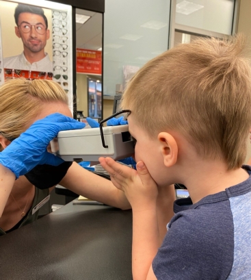
(counter)Intuition
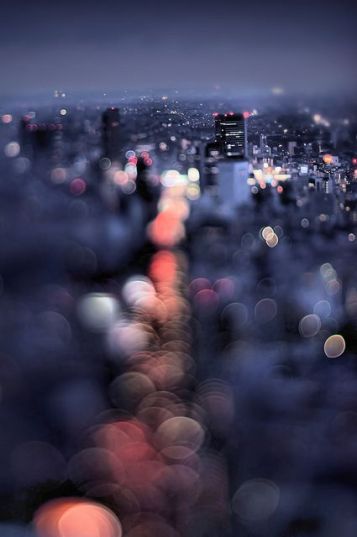
Most people recognize farsightedness as a common vision condition in which you can see distant objects clearly, but objects nearby may be blurry. This condition feels almost counterintuitive. For how is it possible to see the end in sight when the road to get there is so hazy?
As designers, we are often challenged to be the Rx for the vision “conditions” of our clients. Spectacles of space development. Rose colored lenses. Too often I have left design presentations wondering if the client (or even a coworker) and I are actually looking at the same thing.
Design Vision Chart
 How many times have we heard design is subjective? This is our industry mantra. Do you see what I see? Subjective-ness? Nearsighted-ness? Farsighted-ness? Can farsightedness be a metaphor for seeing the big picture? True, design is in the details, but detail is excrement if the big picture is not understood. Maybe the inability to decipher something so close to you means that you actually need to get a new perspective, new clarity. The challenge here is that as designers we are visionaries and we are often misuderstood because clarity in concept takes months to execute and even longer to build. We need to realize that we cannot have the same expectations of our clients that we do of ourselves, but it is our obligation to guide them through the process.
Lilacs are Purple not Blue?
Throughout my career as a design professional, I have learned (the ‘hard‘ way) that sometimes the original design intent must be completely scrapped in order for designer and client to see “eye to eye”. This is part of the process, part of the growth, part of the journey. Those original ideas we felt SO propelled by may have to be completely abandoned in order for new vision to happen. For you ‘see’… if you just try to course correct them, they will never have the same intention nor aesthetic value.
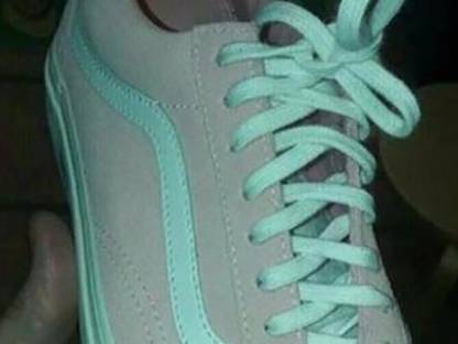
When this van’s challenge was released in 2017, it went VIRAL. Photoshop identifies the color as teal. After color correction, the shoes become “blossom/white”?!
The difference depends on your sensitivity to light and how your brain is interpreting that light. It is also due to poor lighting in the image. My Answer?: The shoe is blossom and white!… OR IS IT?
The idea here is neither answer is wrong. As everyone’s brain is different, we each interpret electrical signs differently, giving us a unique translation of signals – including colour. We can either fight the battle of indifference or celebrate it. In design, scrap of intent is a vulnerable choice and is has a direct correlation to empathy. As Brene’ Brown says best (on the matter), “In order to connect with you, I have to connect with something in myself that knows the feeling.”
One Lane Bridge
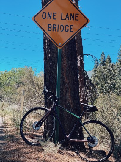 So, is the problem actually ‘vision’? Or is it design introspection? What we need to remember (as designers) is that our vision is not a one lane bridge. If it was, there would be no need for presentations, no need for approvals. Part of the fun in what we have chosen to do for most hours of our day relies on the client’s belief in it. And that my design friends, IS counterintuitive to how we have been told to live our lives.
We are no strangers to rejection. It has nothing to do with ‘creative’ unworthiness. The challenge is to find the sweet spot between maintaining our design authenticity without compromising our integrity. So… keep those initial concepts you had greater belief in in your back pocket 😉 for there will be a time someone will believe in that vision too – it may just not be until you are ready for a new Rx.
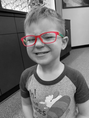
(Dedicated to my sweet farsighted Knoxie who helps bring clarity to my world every day.)
