‘Uncommon’… (by design)

Ecole-e-Afrodite-Driade
Photo Credit: Boca Do Lobo

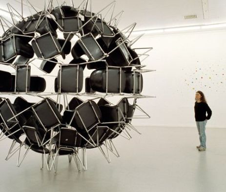
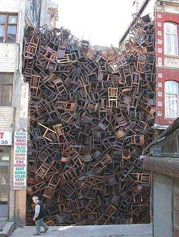
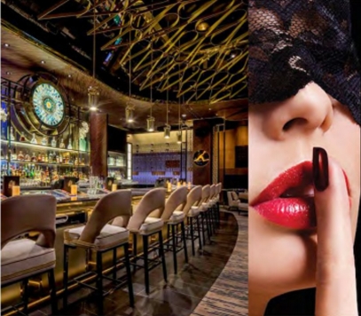
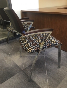
“It’s just furniture”.  Oh, is it?  This phrase could not frustrate me more.  I came from a hospitality background where there was a great understanding of the complexity of FFE (furniture, fixtures and equipment – for Suzie’s clarification).

In the hotel business, everything is custom.  Every venue operator wanted something no one else had.  Something that hadn’t been seen before.  Something ‘uncommon’.

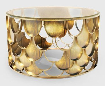
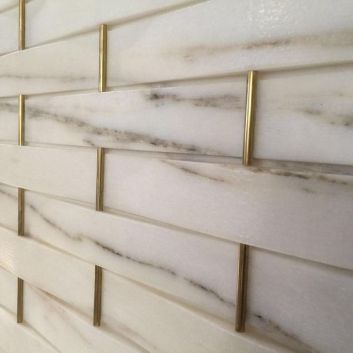
You don’t find ‘uncommon’ in a vignette on the showroom floor at RC Willey.  ‘Uncommon’ has to be created.  ‘Uncommon’ has to be designed.  Interior design isn’t about filling a box with ‘furniture’ and lamps and carpet.  The environment is reactionary because the elements are custom, not common.  They are designed along with the environment… simultaneously… they too are part of the vision.

Sorry, it’s Proprietary

cfeb62fc23be63e0acaecf8adde56bf5At the resort design department, we would often receive requests from tourists asking where they could get the chair they sat in in venue ‘x’ or the nightstand from their hotel room.  The response, was… you can’t.  These items are custom.  The design is proprietary.  It’s one of a kind.

Design isn’t about collecting and arranging.  Design is about vision and creation.  In all elements.

These elements began on trace paper just as our space allocations did.  They developed into CAD paste-ups for CD issuance.  They were approved via shop drawing and often traveled by boat through customs to their final design destination so your ‘tourist’ (end user) could slam their vacation cocktail on top of them before closing their black out shades (which were also proprietary) for the evening.

Scroll and Order?

48b9e0917ab47fe551891c2014d9d545
Photo Credit: Rebel Circus

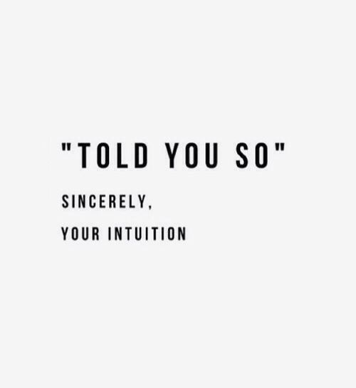
“I saw that on Pinterest”, “I saw that on HGTeaV“… That’s nice.

The fight we, design professionals, continue to face is in this day and age, is that everyone (including these ‘tourists’) is a designer.  They’re not.  They’re naive.  They didn’t study brick and mortar and they certainly never “erected” it.

They study scroll and order.  They can’t envision design until they see it… and then all they do is purchase and replicate (and maybe change the wall color).

They are clueless and they should be provided stickers as ‘freebies’ with their Wayfair orders so they can continue to decorate… or at least a hand signal (from design professionals) at check out.

(Design) Energy is measured in Kelvin

IMG_2989It is exhausting to constantly defend our worth as designers.  Bur, the reality is, the Suzie’s of the world won’t ever be in our shoes nor do we want to invite her to wear them.  Our design shoes actually have to meet OSHA requirements.  Hers do not.

We need to save our energy and frustrations (for those who erect nothing but middle fingers in this industry)… for our projects.  For this energy is far more useful implemented there, with intent.


Visual call to action:

3f66bfcf6cc896bbf7feeaad4bf9f6a5
Photo Credit: Pinterest


Discontinued… (by design).

512f0ae280b2872387b3cab8d8674110
Photo Credit: Pinterest

I had a landscape architecture professor in my undergraduate study who used to say, “If an idiot can do it, design it out!”?  As a student, it was difficult to understand the magnitude of this statement.  At this stage of learning, we executed intent without necessarily ensuring safety or function.  Those projects were about pushing the mind more and the functionality less.  Those projects (I made them too) were design naivety.

As professionals, we don’t have this luxury.  We cashed in our naivety cards in exchange for our design credentials… and we should have.


Architecture without people is sculpture.

img_2673.jpgWe have taken oaths to protect the health, safety and welfare of the general public.  We have a responsibility to know… better.  As designers, we must tap into our mama bear premonitions.  We must invoke design foresight – just as mothers foresee their children falling just before they do… and extend a hand quickly (or at least a wipe in the event we weren’t fast enough).

We must envision our vision occupied.  We must think about the interactions of our users with our spaces.  We must intentionally sculpt environments that eliminate safety risks (and keep the sunscreen out of arm’s reach).  We must design out risk while we simultaneously develop function.  And then we must wrap it all up in aesthetic value.


(design) Risk isn’t an emoji

1024px-Emoji_u1f64b.svg

Design risks take on many forms.  They look like many things.  They morph  based on a space being deemed public versus one that is private.  One that is residential versus commercial.  One that is interior versus exterior.  These risks may be ‘shiny’ – a crystal chandelier for example that extends into human reach or a stunning polished floor finish that doesn’t meet coefficients for slip resistance in wet areas.  It may even be a discontinued product that will only be available for install, but not for change out or maintenance.

Redesigning for risk can crush a designer’s heart.  And it has… crushed me…  It is frustrating.  It is necessary.  Solving these issues both functionally and aesthetically is (unfortunately) our problem.  Designing out risk will change the look of the original vision, but it shouldn’t jeopardize the intent.

Omit the Catastrophy

Solution seeking is part of the design process.  We have all learned from failure.  Each time we have installed something that did not work (created risk), we have added to our (design) archive collection of “I may love you, but you are off limits… don’t worry, you will always be pretty, but you will have to remain a ‘sample’ for you are a ticking time bomb”.

Some risk is unavoidable, it is why we carry contingency, but as our experience deepens, we do get better at omitting it… from conception.

4f2662d77bb8dbfe464c8325519a9f91
Photo Credit: Pinterest

So, designers, don’t forget the risks you were too naive to understand (until you installed them), for they make you (us) better.  Instead, turn them into (design) ‘Lessons Learned‘ and actually learn from them… for they will resonate with you longer than (design) accomplishments… and they will propel you from here to there… because there is more beautiful than you ever imagined.

(design) Butterflies.

_DSC7376
Photo Credit: 1st Dibs

Butterflies.  This delicate creature’s meaning is anything but delicate.  The symbol of the butterfly is one of transcendence.  Many associate this insect with change or transformation.  Perhaps to you, it is a symbol of the soul?  A symbol of promise?  A symbol of hope?  A symbol of reincarnation?  A sign of change?  … Or, perhaps to me.

The cliche statement “she gives me butterflies” has deep connotations and it is because of the fact that we can’t really ‘understand’.  We can “feel” the butterflies (to some degree), but we can’t always define the reason for them.  They are not palpable.  They are about Energy.  Excitement.  Newness.  Evocation.  Unexplored value.  This feeling is poignant and infrequent… and that is what makes it memorable.

The Very Hungry Designer (#caterpillar)

e15139502d7308ae9246d4dafac1f3ee
Photo Credit: Pinterest

This Easter, I “erected” butterflies with my children.  We began the process by building a habitat and we watched these caterpillars stuff themselves with nutrients, and embark on a journey of consecutive molting until they grew plumper and longer and finally stopped eating (it was disgusting).  We watched as they attached themselves upside down to the underside of their habitat, morph into shiny cocoons (known as the chrysalis) and “harden”.  Though they ostensibly seemed dormant, the transformation that was happening inside the chrysalis was radical.

At ages one and four, it was a challenge to explain to them (my children) what was still going on while we waited.  It was hard for them to believe that so much was still happening while the construction ‘walls’ were up.  For a child, 7-10 days is an eternity to wait – especially when they don’t really understand what will be unveiled or why it would take so long to get there.  They had to have hope.  They had to trust me.

The (design) Chrysalis

IMG_2328

As designers, we are so fortunate to be part of transformation, everyday in every project.  We transform our minds, our environments, our users’ (thoughts), our user’s trust.  We work SO “hard” to explain and to execute our visions for those who may be visionless.

Sure, our owners and clients (reluctantly) approve layouts, finishes and budget increases, but they may not be fully aware of how the ‘approved’ elements will result in wholeness.  They may still have difficulty envisioning the vision.  So, to compensate for what is occurring during gestation (that can’t be understood) they (our clients, our children) have to have some degree of trust.  Trust in us, the design professionals to take the (deemed disgusting) caterpillars they hand us and transform them into butterflies.

Why, if not for Butterflies?

This slideshow requires JavaScript.

How many times in your life can you remember “having butterflies”?  Can you think about it without smiling?  OK, if it isn’t your ex-wife can you?  I bet you can count the occurrences on one hand.  What gave them to you?  Anticipation?  Vulnerability?Surrender?

The symbolic meaning of butterflies, though intangible, can provide for each of us (designers) relative insight.  We can relate these stages of metamorphosis to our projects and even to our own lives.  As designers, we (and our projects) have experienced times of vulnerability, the need to develop (professional) thick skin, moments of weakness and ravenous hunger… and even… YES… moments of miraculous expansion.

As designers, we are the instructors of this metamorphosis.  We are creators of the Oh My!, instigators of the transcendence, and challengers of the embracement of change… and… we are so casual about it… in our practice.

So, designers, continue to be casual, (for this is where we find our humility in our work), but not just in your work (the easy part)…  go bigger… BE casual in your lives… and BELIEVE, believe in…  in (each stage of) the process.

(design) Precision.

4a1b0598583ff7e9f716a3ec602e2397
Photo Credit: Pinterest

Perfection = 1/4″?

e01ad72198a64457b88e2c50249f5205

Designers are perfectionists.  The challenge is that we rely on consultants and trades to execute the precision we envision.  So we have to establish tolerance for intolerance.  And in (design), tolerances usually come in 1/4”! Yes, this means, as designers, we need to surrender our desire for the unobtainable 1/16″ and have tolerance.

As we create, the important thing to remember is that ambiguity cannot be executed.  Our DIY formulas (if we entertain Suzie here and discredit ourselves for a moment) are ‘specific’ and they come in the form of Construction Documentation (and specifications – novel!).

Even Tolerance has Intent

3d447768247fcdb30ed1e523860a11d0
Photo Credit: Pinterest

I may have left Las Vegas, but as I continue to design, I don’t ignore the odds.  I intentionally avoid (design) risk.  Design assumptions are costly.  There is a reason that the relationship between architects and engineers and contractors is not (truly) symbiotic.  You, the design professional, (remember you – the one who gets hired to think differently?) Hi there – yes you… you have an obligation to establish tolerance.

It’s important to understand what tolerance is (bear with me).  ASME Y14.5M defines tolerance as “the total amount a specific dimension is permitted to vary.  the tolerance is the difference between the maximum and minimum limits.”  So what is allowable to you?  The designer?  This is the fun part (if documents were considered fun).  This is where you get to implement your tolerance band.

Establishing (design) Limits.  (of course)

c4994202c197874f2d386590a7f67ac0
Photo Credit: Pinterest

A tolerance band is a range of (considered) allowable dimensions.  The larger the difference between upper and lower limits, the larger the band.  This is “loose” tolerance.  Ever heard of bandwidth? – how‘s yours?  The opposite of this or the smaller the tolerance band, the “tighter” the tolerance.  Did I spark interest?  Finally…

Deviating from ‘nominal’

Establishing dimensional tolerances are key in (design) constructability.  By providing them in documentation, you (the designer) can clarify your intent and give the contractor the leeway for appropriate means and methods… and he can get “back” to you… and then you can redline the hell out of his first pass at a shop drawing!  #architecturaljoy.  A.Void redundancy in documentation and this first round will go much “smoother”.  Speaking of “smooth”

Level 5 Finish – LOL!

b1c8c3d4467e6f6e34dac8ae2a11d33e

This really is laughable, yet we continue to specify it (Level 5, that is).  But, here is the kicker… someone else is responsible for erecting it.  Not you, you little perfectionist you.

Who is responsible?… ‘that’ guy is (the one to the left)… and, ‘that’ guy doesn’t give a shit about your (documented) “finish” schedule.  He has his own agenda.  He may even be union?

Your carefully arranged, industry appropriated, architectural ‘prep and prepare walls’ ‘level 5 finish’ to “receive” ‘owner provided wallcover’ is a joke to him.  So as you indicate, remind yourself of intended tolerance and then blue tape the hell out of the wall at architectural punch!

Square Peg, Round Hole.

edc7117426105cad849da0178ea9e05c
Photo Credit: Pinterest

I wish I could tell you that the world was perfect.  That this personality perfectionism that permeates our industry could be built that way.  It can’t.  Parts must interact with each other.  Trades must interact with each other.  Materials (even) acclimate.  So as a designer, you better follow suit…

Follow suit, then lead, and then, create!  Create AND document so the round “hole” you have imagined that those square pegs can’t fit into (without redundancy) can be built!


Intuition. from a (design) Perspective.

484fd4d22d2d16a0c00946130a89f020

per·spec·tive

pərˈspektiv/

noun
1. the art of drawing solid objects on a two-dimensional surface so as to give the right impression of their height, width, depth, and position in relation to each other when viewed from a particular point.

2. a particular attitude toward or way of regarding something; a point of view.

The Design Truth

285c53fe648bc385a8e17a0b3b2e3a32
Photo Credit: Pinterest

In an interview a few months back, I was asked by my potential employer as he vetted through my design portfolio, where my ‘ideas’ come from…  This is a challenging ask, but an even more difficult answer.

As designers, there is sometimes a bit of guilt associated with this response.  A humility that we have to surrender to answer.  For creative individuals, it’s not about how we did something… it’s just about how we saw something.  This is the design truth.

We can’t provide a DIY strategy for our design intuitions.  We are (hopefully) paid for our perspectives and we should be proud of the way we add colors to the world that don’t exist.  We are needed and valued because we intuitively seduce (with intent, of course!).

(design) Seduction

8ac19201a8c2645bf1b916497f01b23d
Photo Credit: Pinterest
We think of intuition as a magical phenomenon—but hunches are formed out of our past experiences and knowledge.  Our visual thinking is (design) seduction and the emotive responses visual thinking yield are ‘magical’.  This is precisely why we do what we do.  Part of the ‘magic’ is the response we generate via seduction.  As visionaries, we (designers) have seen the end result throughout the erection.  We created it.  We aren’t wowed at opening by stepping into a “space” that already existed to us – for the space was in our mind’s eye from cognition.  What we are wowed by are the reactions of others as they step into
our visions.  For those wows can’t be anticipated.

Haunted by (design) Doubt?!

It is true that throughout the (design) process, we (the designers) doubt, even in our certainty.  There are many lost hours of sleep attributed to (design) doubt.  Doubt is part of the creative process.  It is our design intuition telling us that our visual thought isn’t quite vetted out.  But, really, we already know… we are aware of elements that don’t feel right.  We recognize cut corners… Vision is evolving.
Trust both your intuition and your doubt and relax.  The execution will get “nailed” especially when you are the one in control of the hammer…
b56f81eb9c5b7ee3924ed0ac49bac03d
Photo Credit: Pinterest


A.Void. (by design).

Untitled-1
Photo Credit: Pinterest

There is a concept in the visual arts known as horror vacui or ‘fear of empty space’.

The term was originally used by Italian art critic and scholar Mario Praz to describe the suffocating atmosphere and clutter of interior design in the Victorian age (Wikipedia).  This was an architectural criticism that spoke to perceived environmental discomfort – ironically, intentional (discomfort).  And, this “discomfort” actually took work, (a ton of work) to create!  These ‘suffocating’ environments were rich and overloaded with detail, with thought, and with… intent.

What was missing though, at the time, was the understanding of the psychological impact of ‘void’ and the value of ‘space’.

The Modern (educated) understanding of the term is now an “inverse” relationship between horror vacui and value perception.

Empty Space doesn’t equal Emptiness

There is a natural tendency for humans to fill “voids” instead of respecting them.   We fill our closets, our pantries, our storage units and our lives (for that matter) with clutter not because we need it all, but because we have ‘room’.  We have become incapacitated by capacity.  Our Amazon cart may technically be empty, but how many items do we have ‘saved for later’ so that we can “fill” it back up instantly with a click of ‘add to cart’?

As designers, we need to embrace the value that is void and A.Void.  Avoid fearing meaningless emptiness or meaningless fullness, for that matter.  Instead, we need to intentionally implement void and give ourselves and our users the chance to perceive value.

Value Nothing, It (could be) Everything

John Pawson . St Moritz Church . Augsburg (1)
Photo Credit: Yellow Trace

It is true that modern sophistication has developed appreciation of understatement.  As we have educated ourselves (as designers), we have come to our ‘senses’.  Value is better understood via void, via emphasis.  For void renders appreciation.

I had a professor in one of my early introduction to architecture studio courses explain value and void to me in a way, well, a way both men and women can appreciate.  He asked if we (a class – full of gen-“xxx”ers) would be more intrigued to see a beautiful woman in a black bikini on a beach or a beautiful woman ‘fully’ naked on the same beach.  His answer was actually the woman in the black bikini (I know – SURPRISE!)?  See… the woman in the bikini still has a story to tell… she still has undiscovered value.  In her understatement, she evokes wonder and intrigue but the viewer is able to establish value via void (in this case via the black bikini).

I.Dare.You.

In the era of Praz, ‘more’ (things) equaled affluence, but now we are fortunate to embrace a time where experiences are perceived as ‘more’ and ‘less’ may even be perceived as ‘better’ (Millennial credit here)…

So, designers… Start with too many ideas and eliminate.  Eliminate your clutter.  From your pantry, from your storage unit, from your projects, from your lives.  Embrace the trend.  Challenge yourselves to paint clutter ONE color – and eliminate the distractions.

Or…  Don’t?  Keep it and I dare you (Suzie)… to pull a chair from the bottom!

7b7b431f6a847b175581921d084299a5
Photo Credit: Pinterest

(design) Augmentation

design augmentation
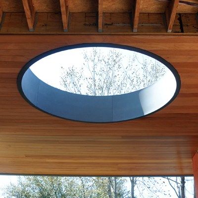
One of the greatest challenges we face as designers is respect.  Not self-respect (save that for your therapist), but respect for architectural antiquity.  Respect for the architectural history that preceded us… a past full of ingenuity and authenticity.  A past that spoke to each of us so viscerally that we were influenced to become part of it (and hopefully, this far into our careers, still are).

It is easy to start a project from scratch.  With a clean slate, design boundaries are truly limitless.  As design professionals, we exist to create, to mold, to design and to build, but it is when we have to work to reinvent the invented that the real puzzle begins.

Respect the Unrespected

It is impossible to not be excited by the new innovations and builds happening in our time.  #webetterbe.  As designers, we strive to create something that hasn’t been done before.  We are thrilled by the chance to install new finish materials or technology packages that haven’t been seen to date… to be the first to gain the recognition for their discovery… to be participants in the (design) gestation and erection of modern spaces.  This is “easy”.

So how do we get ourselves just as ‘thrilled’ at the chance to refurbish?  How do we breathe life back into architecture that once breathed on its own?  What parts do we salvage?  What do we rehabilitate, restore, preserve and/or recreate?  This journey to architectural “augmentation” begins first with… respect… (remember that?)

It’s about the Time. Period.

today

We all have physical features that we wouldn’t have chosen (given the option) and would be ‘thrilled’ to change, but we are a “package” deal.  We are of our time.  We may be able to make physical augmentations, with assistance, but only to a certain extent…  we are still only able to ‘improve’ upon our “bones”, our underlying core, our genetics.  As we have seen in numerous cases in the celebrity sector, augmentation, taken too far can render one nearly unrecognizable.

Funny enough though, this unrecogniz”ability” we can recognize.  We can sense when something doesn’t “fit”.  Whe know when wholeness was jeopardized…

What’s in a Face-ade?

As is true with human ‘refurbishment’, architectural refurbishment must be recreated with respect to the existing ‘core’.  For example, you can’t take a “concept-less” modern interior “package” and slap it into a mid-century facade.  It’s wrong… and I believe it to be professionally unethical.  The key is to modernize the space while respecting the history.

For me, this shift (in my work) actually became professional augmentation – and I take it personal.  Coming from a background in Las Vegas hospitality… a background “full” of augmentation (as you can imagine)… a background I learned to embrace and appreciate for its courage… (not its ‘real'(e)’state’).  A background where facades are facades… and no one expects them to be anything more than that.  It is liberating, actually.  Talk about transparency – via lace, (usually).

untitled-1.jpg

History Repeats Itself, yes, but… should it?

What happens in Vegas, doesn’t always stay in Vegas – so here I am!

Though my grass may not be ‘greener’, it is certainly less artificial!  So… let’s look at a personal example of some (more historically) authentic work in my ‘new’ backyard:

palmerengineering
Photo Credit: University of Nevada, Reno
University of Nevada, Reno
Palmer Engineering Building Renovation
Built: 1940-1941
Renovated: 2017

This building is one of many on the University of Nevada, Reno campus that is on the National Historic Building Registry.  Because of the seismic retrofits that needed to be completed, a ‘new’ building was essential built within the ‘existing’ architectural ‘shell’.

In addition, the renovation required removal and reinstallation of a percentage of building materials to maintain its title of ‘historic’ as well as upgrades designed to support the high tech, advanced manufacturing, and aerospace engineering future of the University of Nevada, Reno.  Quite the juxtaposition!  Quite the design challenge!  How do you respect the antiquity, in this case, while creating a space that also serves a cutting edge function?  One that can also be used for modern recruitment but holds true to originality?

By respecting palette and patterns of the time as well as the original architectural “bones” and by properly re-placing the ‘old’ materials in an innovative way… ‘new’, contemporary life was breathed into architectural history.  The design principles of proportion and scale contemporized the ‘old’ without disrespecting it.

UNR_Photography_Page_1

IMG_2520  IMG_2522 3f41106636c4e4099a24b84872c11110

If all else fails, “poke” it

So, As you are called to reinvent the invented, design and conceptualize first, with RESPECT, (and then you can resort to botox)!


(design) ‘real'(e)’state’

image1

Have you ever sat and watched your children climb?  Have you watched them… real’ly watched them… just… run?  Children don’t worry about distance or height.  They don’t worry about the hurdles they have overcome on the path or how much ground they have already leveraged.  They don’t preface their minds with their fitness levels and weaken themselves slightly at the starting line.  Children don’t concern themselves with their abilities (or lack of abilities) or “tolerances”.  They don’t worry about HOW they are going to get “down”.

Children think about one thing… Ok, perhaps two things:

1.) They think about their destination (their goal) and 

2.) They think about who they are competing against to attain it

This is just novel to me.  This is what we are learning (and hopefully doing) as we brand ourselves, but by (this) theory, it is exactly what we once already knew…

For children, courage is core.  As much as they question, it is never themselves.  It is never their capabilities.  It is never their greatness.  Via life’s design, our children are transformed from (innately) courageous to fearful.  Perhaps this is why they are  considered our (off)”spring”?

From The BOOK of AWAKENING by Mark Nepo:

image1 (1)

image2.jpeg

‘real'(e)’state’

According to businessdictionary.com, realestate, by definition is land and anything fixed, immovable, or permanently attached to it such as appurtenances, buildings, fences, fixtures, improvements, roads, shrubs and trees (but not growing crops), sewers, structures, utility systems, and walls.

So, by definition here, it is clarified that growing crops are not fixed, not permanent, not ‘real’estate?  In ‘real’ity though, nothing is more ‘real’ than a child’s ‘state’ and it is this ‘real’(e)‘state’ that we, as parents and design professionals, should return to for “seedlings” of inspiration, as often as possible.

Being “fixed” doesn’t deem you ‘reel’

883b9e83d5fea1e73774b3682487fb8f
Photo Credit: Pinterest

If we instill this courage and fearlessness we are inspired by in our (off)”spring” into our design work, we would find the immediate limitations we place on ourselves would be nonexistent.

We are taught in design school and in our careers, early on, to “push” (design) boundaries.

We know that a line cast too far out into water can always be ‘reel’ed back in (and sometimes will need to be due to ‘fixed’ design constraints) but you can’t give the same initial momentum behind the same cast once it is thrown.

Like Kahn’s “sun”, we must (re)find our greatness.  We must reinvent ourselves, our concepts, our content, our ideas.  Unlike our children, we must leverage what we have learned on our paths, on our climbs.  This distance is our professional ‘real’(e)‘state’.  The journey is what has ‘fixed’ us.  The path is what has rendered us experts.  The steps to the destination have erected credibility, established credentials and validated (design) wisdom.  We are products of the process and it is the respect and instillation of the process and principles that set us apart (from DIY Suzie).

(design) is Within Reach

My challenge to you, as design professionals, is to crack, to commit, to Crack ALL THE WAY.  Climb heights and don’t worry about how you will get back down until you “reach” your limitless destination.

hands


In Memory of Frank ‘Papa’ Lyttle April 30, 1933 – April 3, 2018

IMG_2979

Wishing you eternal peace in your new ‘real'(e)’state’

(design) Intervention

lyttle-58
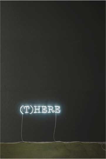
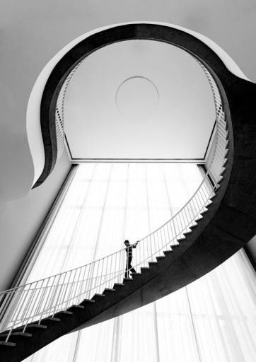
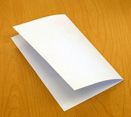
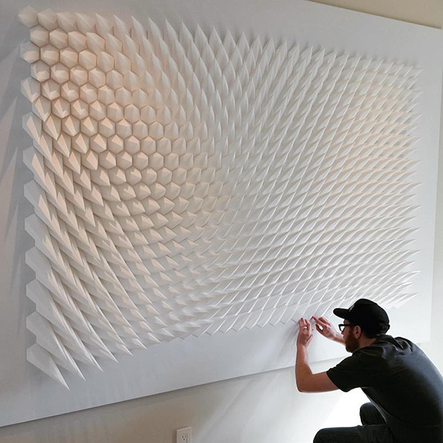
Where does the creative bridge begin and end?  Where does the intervention “fold” happen?  Once our gestation period ends, we enter this world a clean slate, full of curiosity, color and wonder… Our learning develops via observation, correlation and experimentation.

As children, we actually benefit from lack of wisdom and our search for the how is guided by praise and encouragement from our parents and mentors.  We have no understanding of the impossible.  In our innocence, all is bright, all is brilliant, all is colorful and all design ideas are capable of “erection“.

IMG_1888.jpg

We learn by the kinesthetic interaction with our environments.  We are wired to  simplify the complex – to see extraordinary in the ordinary.  We lift our arms wide open into the universe and twirl without concern of judgement… we fearlessly push limitations of balance for the thrill of the erection until… we are intervened.

Simplifying the Complex or Complicating the Simple?

So where is this “fold” over?  At what point in learning do we begin to pull our arms to our core and truncate ourselves?  At what threshold does color begin to diminish?  When and why do we begin to hesitate?  Why do we evolve from this innocent creative questioning our world and begin to question ourselves instead?  Where is the balance between simplification and complication and what defines it?  What comes first?

6455620021_1dbb86d5bb
Photo Credit: Flicker

I had a beautiful art professor explain this idea to me once in terms of something we could all agree to be extremely ordinary – a blank sheet of paper.

By adding just one fold to this piece of ordinary paper it is made more complex.  Seems simple enough right?  Well, what if the complexity of the folds were replicated with design intent?  What if imagination allowed for creation to happen via the ordinary?  What would that look like, what would that feel like?  Would you (or Suzie) believe it could become so complex it could be defined by unity/harmony, form, balance and movement?

Would you believe it could result in this?:

geometric-paper-sculpturea-1
Photo Credit: The Mind Circle
17e9a0beda7e654e7460933f5b708712
Photo Credit: Pinterest

Hard to imagine that a simple piece of paper could re-instill curiosity, brilliance and wonder, but it can, obviously.  This is our greatest professional design challenge and it should render our greatest accomplishments.

We are so fortunate.  We are the crafters of spaces that yield emotive responses.  Our job is to shock, to awe, to bring about the (hypothetical, of course) “Oh My!”.

As designers, we must dream in colors that don’t exist and then figure out how to create them.  We must embrace the possibility of erections (innocent or not) and let the engineering consultants (and second wives) figure out how to balance them.  We MUST push the envelope which ironically is a folded piece of paper…

We must remind ourselves, as Paul Rand so eloquently stated, “Design is so simple, that’s why it is so complicated.”

As a design professional, I challenge you to re-evoke this sense of wonder.  Push limitations and like a child, open your arms widely into the universe and twirl…

The (design) Erection.

IMG_1828
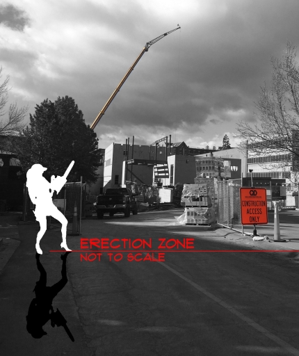
Typically an “erection” would precede “gestation“, but the design process is an exception to this “typical” arrangement.  Construction Administration (CA) is the phase of the design process where documentation is handed off to the “winning” contractor and a building or space can FINALLY be “erected”.

As a rule, the role of the  architect/designer in CA is that of an ‘overseer’.  She is contracted at this point  to ensure that the project is built according to her design documentation but, the “bulk” of the work should shift from the architect/designer to the contractor.

More often than not, more design time is required during CA than originally “desired” or anticipated.  Regardless of the hours on your design contract, if you don’t “perform” here, you will end up with a “flaccid” design situation.  See, the contractor (unfortunately) doesn’t have the same level of pride for the build (even though he is building it, technically) because he didn’t nurture the project from conception.  He is the foster father – liable for his construction window, his means and methods, his bid value and contingency allowance and his turnover dates, but once they are accomplished, he is on to the next project.

Changing “Position”

So how to we (as designers) “perform” during CA?  We attend regular (weekly) site visits  with the contractor and the owner to ensure that the “erection” is proceeding according to the design intent.    Additional field visits are also conducted at critical stages of the process.  For instance, before wall “studs” are enclosed with gypsum board, a review of in-wall “piping” or wiring would be pertinent…

If the contractor needs clarification for a conflict on drawings sheets or additional information to meet the intent is required, a formal Request for Information (RFI) is submitted to the architect.  The architect responds formally to the contractor via sketches or written clarification.  At times, the intent that was assumed by the contractor and clarified by the architect results in a change that will affect the construction schedule or budget.  This is referred to as a construction ‘change order’ and usually requires owner approval to proceed.

You May Require a Blue Pill, After All   (you know, just in case)

keep-calm-and-take-the-blue-pill-3
Photo Credit: Keep Calm

In every construction project, there are unknown variables.  This is assumed.  To account for them in the beginning, both the architect and the contractor will build in contingency.  The designer will typically carry 5-10% of the overall design budget for design contingency and the contractor could carry anywhere from 10-20% of the construction budget for coverage depending upon what may be “anticipated”, but unknown.

Construction unknowns can result from something small (i.e. a specified tile has been discontinued) to something that could be very costly (i.e. a utility line discovered when footings were excavated).  In these instances, the architect serves as a resource to the owner (for tile reselection) and potentially a mediator between the client and contractor in case of disagreement (in footing location).

The final design check to ensure what was specified by the architect/designer will be installed by the contractor is controlled through the design Submittal Process.  This process is a quality control point for the designer as well as a final review of build documentation.  Submittals come to the design team in the form of samples, shop drawings, or mock-ups and require design sign off and sometimes even owner approval.

The Final Punch

c2a887a8d4290a5039dd2d17b0d9e482
Photo Credit: Pinterest

When the build is finished, a list of items will be generated that need to be addressed before the “job” is considered substantially complete.  This ‘punch list’ of items is inspected for completion by the architect and final payment is only made when designer and owner agree the items have been completed to her standards.

Typically, the punch list items are minor (i.e. paint touch ups or installation of missing items), but there are times when the contractor is required to redo work that was deemed “unacceptable”.  This punch is also the last chance for the contractor to be held accountable for incomplete or unsatisfactory work.  As soon as close-out documentation is received and final payment is made, it will be up to the owner to maintain the project moving forward (with the exception of warrantied work or equipment).  I warned you about wanting to put that newborn back “in”!

Now that you are (“semi”) happy with that postpartum figure, it’s time to maintain it!

So… Pick up those new conceptual plans and design gloves and get to work!

design punch